Friday, May 20, 2011

BestBuy is the Best

They let me do it (even though it was extra work for them).  They had to pull the SX230 off the display, so I could put my own memory card in it.  They did this, let me take a few pictures (while I took duplicate pictures with the SX210).  This allowed me to get some reasonable comparison (no outdoor photos, but what I got was enough for me as low light was really my focus). 

Now keep in mind that the resolution on the new camera is actually a little less than the older one (12MP vs 14MP).  When I originally wrote up the SX210, I thought 10MP would be on the high end (the Canon PowerShot G series has both a bigger sensor, and 10MP, and it gets really nice pictures, squeezing more pixels onto a smaller sensor seemed like a chore and likely to increase noise). 

The 230 uses the standard Canon Digic sensor, where the 210 was a break away for Canon and used a CCD (actually I was not aware of that initally).  Canon really spec'd out the 230 to be better in low light than the 210 (and needed the processing of the Digic sensor to do that).  All these pictures were taken with similar settings (and either mostly auto, or for the last one, I specified ISO 800).  Click the pictures to get a bigger view.

Lets start off by looking at a full zoom.  This picture is 14x across the store (over the TV section).  Not terribly dark, but dark enough to make photo's challenging.

 SX210


SX230

Now since I used auto, both took different approaches.  The SX210 used ISO 800 and a 1/13 exposure.  The SX230 went to ISO 1600 and had a 1/20 exposure.  Funny thing is, based on the ISO, I would have thought the SX230 would have more noise (it had the higher ISO), but as you can plainly see, it is cleaner.  So far, the SX230 is meeting its claim as the less noisy picture.

Lets keep with text for a minute, but remove the zoom. Honestly the zoom performance should be the same as it is the same lense (really the sensor is the only quality difference, there is GPS, but I am not reviewing that as I do not see the need, I always name my pictures based on where they were taken).


SX210


SX 230


This was taken off a sign right in front of me in the camera department.  Again, on auto settings, the SX230 had the tendency to double the ISO.  In this case the SX210 used an ISO-500 and 1/50 exposure (F/4 for apeture, in the zoom shot above, the apetures were identical at f/5.4).  The SX230 bumped the ISO to ISO-1000 and the exposure to 1/80 (apeture was f/3.5 not much different, there are not alot of choices on these cameras). 

There was a bit of noise in both of these, but the SX230 definitely outdoes the SX210 even with the ISO setting doubled.  This is looking pretty good for the SX230 (and I am trying to justify an upgrade).

However, text is sort of easy, lets do a portrait.  This will be a zoomed in section (just above the left eye).  Keeps my model happy (as she does not make the blog, she was not ready for her picture) and allows us to again look for the noise.


SX 210


SX230

Now things start to get interesting.  First, there is a little difference in size.  Part of it might have been not being zoomed exactly (or leaning etc), but part is also the number of MP (14 vs 12).  However, trust me, either would print out more than spectacular even at 8X10, and both could even go larger (I have done 6MP on 13x17 and it looks good).  However, that is not the issue. 

The SX230 is begining to look softer.  Now this is not totally fair as the mode was portrait, and softness is often desired in a portrait, but the SX210 is definitely sharper (the fear is the SX230 is softer due to noise reduction being done post processing).  Note the SX210 was ISO 200 1/60 f/3.1 and the SX230 was ISO-320 1/60 and f3/1.  The fact that everything but the ISO is the same does mean that the processors interpreted this differently (might be light around her, zoom etc). 

So the portrait brings up a possible problem (but it could be a one off picture issue as well).  Finally need to look at something to verify that.  In order to remove the ISO issue the last two pictures were taken at ISO 800 (so we are comparing apples to apples, not just marveling that the SX230 has less noise with a higher ISO).  Note the exposure was identical as well in the following pictures.

The first image is a highlyt zoomed in image of a camera and its sign on an end cap (the end cap had the point of focus, so it should be fairly sharp). 


SX210


SX230

Both pictures are noisy (it is not bright in the store, even if it looks it to the eye).  However, the SX230 both looks less noisy and a little sharper.  However, here the difference does not seem as pronounced as it did in the text above (though still more than obvious).  Lets grab one more section from this photo.  We had a small gamer playing an xbox, who was nice enough to stay in the frame for both shots.  Note that these snips are not taken from the focus point, so they are expected to be a little out of focus.

SX210


SX230

Ok, so no face, but we have his pants, and that verizon guy asking if you can hear him.  The SX230 is definitely sharper and less noisy at the same ISO as the SX210.  So Canon did hear the complaints and made the improvements.  I have not decided if it is enough better that I want to spend the $300+ to upgrade (they are not cheap cameras), but you can make your own decision.

It would be interesting to take many portraits and compare to see if it was just a single picture, or if there is some noise reduction algorithm involved (I would not be surprised if it were the later as that is listed as one of the improvements in the new camera).  However, changing modes seems to change the noise reduction (as it should), so you should have plenty of control to get the picture the way you want (and with less noise than on the SX210).

One thing to note.  I keep my SX210 in auto mode, but have the P program mode set for ISO 200 and flash on (I can turn off the flash by pushing it down).  I probably use both of these modes as often (the ISO 200 allowed me to keep the noise to a reasonable level).  I think the same would have to be done on the SX230.  It seemed to want to increase the ISO.  Though there is less noise than with the SX210, still a lower ISO could make even a cleaner picture.  It would take some playing with to figure out.

After this, I am back to comparing the SX210 to my HTC Inspire (I wanted to take a break after the below comparison to see how the SX210 stacked against its newest update - as the HTC Inspire performed fairly well so far against the SX210).  So come back (I might even be able to compare some infrared pictures from both).


Friday, May 6, 2011

Well, so far - I am surprised

Now that everything is fixed, I took some time to start comparing my SX210 to my HTC Inspire.  I figured my first test would be were both should perform well - outside in a nice bright day.  Note the previous review of the SX210 did show some noise at higher ISO with less light.  I expected both to perform well, but the SX210 to show its stuff.  However, this is why we run the tests.

There have been no modifications (except size or cropping on the close ups) to the photos.  So you are seeing them as they come out of the camera or the phone (and as always click to get a larger version but it will be large as I left them as the original 14mp (for the SX210) and 8mp (for the HTC Inspire).  All pictures were taken in full auto mode.


The upper picture is from the SX210, and the lower one is from the Inspire.  This was a good picture to take as it seemed to stretch the contrast in the Inspire (not it seems to lack a little).  However, the colors are beter in the inpire (look to the sky and the tracks (the rust color comes through a bit better).  Performing some adjustments in the SX210 prior to taking the picture could probably improve the colors, but as it stands it would be easier to work the Inspire picture in photo shop.  So in this picture not really an edge.


Once again the SX210 is the upper image.  The bird house was the focus point in the picture.  The Inspire just got a sharper image than the SX210.  Also the lighting and coloring looked better with the Inspire.  This is not looking as good as above, as in this picture there is a definite winner, and it is the phone (if you do not see it in the images above, click on them and bring up the full size - you will see the softness in the SX210 which I commented about in my original review.


For the next 2 pictures I put the SX210 into widescreen mode.  This reduces the pixel count a bit (but cutting off the top and bottom), but duplicates the camera for dimensions (still has more pixels, but the shape is the same).  I did this to rule out liking wide format images better.


Again, the SX210 is on the top, but the better picture comes from the Inspire.  The colors are more correct from the inspire, and it captured more of the blue sky.  Additionally, the sharpness is better on the inspire (the bag on the fence was the focus point).  There is just a blue hue to the SX210 that needs to be removed, and the saturation needs to be improved (and again the softness overcome).  The Inspire also has more of the picture in focus (but there is a reason for that, and I will get to that after the next set).


Once again, the SX210 is above, and again, the better picture came out of the inspire.  Better color, better sharpness and just better tone.  However, a comment about sharpness when comparing different camera types.

If you look closely at the larger images (click on them), the lower image looks sharper both in the foreground and the background..  There is a good reason for this, and that is that the depth of field of the two imaging devices is different. 

To illustrate, on a DSLR, the sensor is further from the rear lense element.  This forces focus to a narrower range of distances (in fact the rule of thumb is that a portable camera has 4 stops more depth of field than a DSLR - as apetrure is the largest factor in depth of field).  The science behind this is a bit complicated, and I will leave that for another day (I have done a study of multiple subjects in the past varying apeture to change the overall feel, maybe this will come up again).

This means that more of the picture is in focus in a pocket camera than a DSLR.  The same effect happens here.  The HTC Inspire will have a larger depth of field than the pocket camera due to the distance between the lense and the sensor. 

So what have we learned.  So far, for certain pictures, the Inspire will not just be able to replace the SX210, but will be able to out perform (I am assuming standard size prints which are very possible with the 8mp from the Inspire, and do not need the 14mp from the SX210).  Now, there could be some things that I could do to make the SX210 perform better (and I will look into them - like changing the color balance etc).  However, the increased depth of field that the phone provides, actually makes it more suited for some types of landscape photography. 

There are some things the Inspire just does not do.  There is no optical zoom on the phone (so getting close to a distant object is not happening).  The SX210 has 14X zoom, and can get close to alot of subjects.  However, some of the softness seen here with the SX210 were also noted in my original review.  Canon just came out with the SX230 which is the next version.  Instead of a CCD it has a back lighted CMOS sensor which is supposed to solve some of the noise issues (and if noise can be solved at the source, then less noise reduction would be needed, so the pictures should be less soft).  Guess I am off to BestBuy to see if I can take a few pictures with my camera and an SX230 there and see how they compare (but I will also compare the SX210 to the Inspire in less than optimal situations).

Tuesday, April 5, 2011

Sorry for the delay - Can a phone replace a pocket camera

So it has been a long time since I posted any pictures.  I will admit I have read some things that bothered me regarding phones replacing pocket cameras.  At the same time I sort of got tired of my Windows Mobile 6.5 phone (it had issues which helped enforce the feeling) and used my free upgrade to get into the Android world (in fact I jumped in whole hog and am typing this on a Motorola Xoom I am playing with).

So what does this have to do with photography?  Well when I first read about people ditching pocket cameras for there phones, I thought this was nuts and was going to dedicate an  update to the topic.  Though I have not changed this opinion I think I see the argument much better.  The options for taking and modifying pictures right on the phone is much better on Android than anything I had used on Windows Mobile (any version).  Note I have looked at the options with the iPhone and though I have no direct experience, they look as good (or better) than I have seen with Android.  Not trying to compare the platforms, but make the point that there has been a step up with phone pictures that I was not aware of.

However does all of this justify movement from away from dedicated pocket cameras to phones.  I do not think so for me anyhow.  If your plan is to post to flickr or some online location, current phones are probably good enough.  However if the goal is to get to print (especially enlargements) the phone just seems soft.

My next post will include some comparisons (sorry my new phone is already broke and being replaced - this seems to be a trend with my electronic hardware that I hope is ending so I can get back on schedule).  I will try and present it in a manner that demonstrates what I mean (or else I will have to eat my words).  I will use the SX210 not the Digital Rebel as all the blogs and articles dealt with phones replacing pocket cameras not DSLRs.

Be back soon.

Wednesday, January 12, 2011

Christmas Lights

We have just gotten through the holiday season, so I took advantage of the surroundings to snap a few pictures.  Guess this is a million different lights (instead of a big sunset).  Christmas lights offer there own challenges as well as there own rewards.  I will start off with one of the more interesting shots.  As always, click on a picture to get a larger version.

This is a picture of Parliment in Ottawa.  There are lights scattered around the entire city, but they do a nice job with the Parliment building (both with trees lit to the side, and the foliage in the front as well as the projectors onto the building.  They actually use this same concept to project other scenes onto the building (for other holidays).  It is a nice touch here, and well done.


One of the things we like to do for Christmas is go to Hershey park.  Yes, some of the rides are open, but they also have plenty of lights (they also have a drive through display, but we stayed too late at the park, and could not get there this year).  This is a picture of the light show.  These lights dance and change color to the music.  There are multiple places to watch the show (I am on one bridge, and you can go at the one in the distance, or one beyond that).  The candy kiss is sitting ontop of the Kissmus tree (a little corny, but you gotta give it to them).


This is a picture from the other side (so again not from the lower bridge in the middle, but the other side).  I wanted to show the opposite (no color).  There are little trees on the left (not lit when I snapped this) that also light up.  The lights can change quickly, so snapping alot of pictures is a must.  These come out nice and sharp because they are taken from a bridge with a strong rail.  When taking these pictures, it is likely you will not be carrying a tripod, so the best alternative is to hold the camera against something solid.  I did that for both of these Hershey pictures and they came out well.  Reducing camera shake is important in trying to get sharp pictures of the lights.


Another visit we like this time of year is Kozair's Christmas Village.  They have the most lights in one setting that I have ever seen.  Unlike Hershey, this is all lights (they do not have the rides Hershey does, the lights do not dance to the music, but they both do have a Santa).  This picture looks sharp as well.  I did not have anything to brace the camera against, so I had to hold still and depend on the anti shake in the SX210.  This worked out better here as there are more (and brighter) lights, so the exposure time was not as long as those up in Hershey (you can see from the shadows near the model buildings from the other lights). Not all the pictures came out this sharp though as some areas were a little darker.


This is a picture of a walkway at Kozair'sI sharpened it a bit, but you can still see it is not as sharp as the Hershey pictures.  The bigger point here is that the cardboard cutouts are very visible (so there is considerable light from all the lights (there are alot of lights)).  Note there are cutouts all around (these are peanuts, there are other christmas themed (many with the stories written on them) throughout the farm.  In locations like these, it is easy to get pictures with lots of lights.  The harder part is finding pictures that make sense (and not just lots of lights).  I tried to segment my shots to do that (Hershey was already worked out due to the bridges and the staged lights).  At Kozairs, I pictured buildings or areas and tried to capture surrounding lights (my pictures thatdid not have a real focus just looked distracted).


I added this picture to show the final hazard for taking Christmas Light pictures.  But first, notice all the smaller buildings in the background.  All lit up, some are small with displays inside of them.  Others are larger with shops inside (gifts, hot chocolate or Santa).  Also all the lights provide enough ambient light for the rocks to show up in the picture.  However having the focus point of the snow man and foreground added to the picture (if I just zoomed in on buildings and lights it would have looked chaotic). 

Now for the final hazard.  Notice all the ice near the waterfall in the foreground.  Baby its cold outside (I heard that somewhere).  So dress warm and enjoy the lights.

Wednesday, December 15, 2010

Sunsets - When Light Gets Dramatic

Sunsets are one of the favorite scenes.  They have been known throughout the ages to be both beatiful and romantic, and stir many emotions.  For a photographer, sunsets are also known as the magic time (when the light is at its best).  I will admit that in the past, I had to work hard to get sunsets to come out really nice.  This was both in camera when taking the picture, and even some post processing.  Seems it was difficult to get the proper exposure on the sky (exposing on the sky properly, at the expense of the ground is the secret to getting good sunset pictures).  Even with all this fiddling, the colors in the picture never matched what i was looking at in real life.  However, this is no longer the case.  The little SX210 in auto mode (yes auto mode) gets great pictures.  I wish I could take more credit for this, but seems this camera is able to capture the colors and not let the extreme wide contrast (from a bright sun down to dark) get in the way.

Though these pictures all had some post processing work, most of it was to change the size up the contrast a little on some (so the ground was less hazy) maybe some lightening (again only 1 or 2) and finally a little sharpening (again mostly for the ground).  I spent under 2 minutes on each picture in post processing (so this is what it looked like coming out of the camera).

My first comment is timing is crucial.  Though you can get good pictures separated even by a few minutes, they will look very different.  Even with this, a few minutes can mean the difference between a great picture and a really bad picture.  I was trying to get a picture of a sunset over a farmhouse, but was not able to get setup in time (it was close though), and missed it (and that picture is not worth showing - all for about 2 minutes).  Remember as always, click the image to get a larger view.

To show you what I mean I have a few pictures taken a few minutes apart.  Though I like all of these (so the wait did not ruin the picture), you will see how different they really came out.  I will start out at the beach in Ocean City, MD.


It was a little hazy when this was taken.  This caused the colors really to bounce, but also left the sun more as a circle (the haze reduced the glare etc).  The colors are nice on this picture, but really that is all.  Other than that, this picture is not that fascinating.  Normally something a little more (clouds or foreground) is a nice offset.  Now, lets wait a minute.


A few minutes later, and all of a sudden the sun is under the haze a little bit more.  This causes us to lose a little of the nice orange, but adds other elements.  We get the halo around the sun (well the haze lit up).  We get the reflection in the water as the sun has moved down (and this has lit the water more so the waves are more visible).  This picture adds some elements to the sunset that improve the picture.  Though both these pictures are nice, the wait of a few minutes might have lost some richness in color, but added other elements to the picture. 

The next pair show even a bigger difference.  These were taken out of a hotel window in Ottawa (just outside the city, looking over the city (though not the center of the city)).  Here a few minutes really changed everything, but again I like both pictures. 


Here is the first picture. it was cloudy, but there was a break below the clouds.  The sky was lit a vivid orange.  This is a nice scene, very different from the natural setting of the beach above.  here we have the steel and cement of civilization with a colorful backdrop.  However, in just a few minutes, this picture also changes, but in his case, the change is much more dramatic.


Just letting the sun set a little more just totally darkened the clouds.  With this different color, the view also needed to be adjusted to take advantage.  The prior image was zoomed in fairly strongly (remember the SX210 has a 14x zoom).  The building from the above picture is off to the left center here.  However to capture the dramatic black and orange sky, and offset it with the lights from below, for this picture we needed to zoom back out and capture the total scene.  In the first Ottawa picture, we wanted to zoom in so we could capture the buildings and close ups of the clouds lit with the brilliant orange sunset.  Below, we did not want to focus on any small details, but zoom back out so we can show the entire dramatic scene.

So as you can see, timing is very important in sunsets.  A few minutes really changes the picture and tells a whole different story.  When you get out and take pictures of the sunset, make sure you are there early enough, and keep clicking (digital is nice that way).  Keep an eye out to make sure you are capturing the elements that really stand out.  You may surprise yourself and end up with multiple good pictures (though they are widely different).

So with that out of the way, lets look at a few other examples of sunset type pictures.  The first does not include the sun at all, but is just the sky just after the sun went down.


This sky was visible upon exiting the local grocery store.  As noted above, I did not have much time, so I pulled out the camera, made sure it was set to auto, and took the picture.  I snapped three pictures, but really this one came out best (as above, timing is critical, and it changes quickly).  I liked the way the sky turned pink, and the texture of the clouds.  The hill in the foreground added some nice contrast.

The next picture reminds me of an old west scene, but the actual taking of it was quite difficult.


We were driving on the highway, and saw this nice multi colored sky  You can still see some of the blue through the clouds, the yellow glow and the clouds all caught different colors.  Again the trees add a nice foreground element.  I really wanted this picture, but did not have time to pull over.  So I flipped the camera to my daughter in the back of the van, and asked her to start shooting (auto mode works - so yes these were taken while we were traveling at ~60mph on the highway).  Note, because it metered on the sky, it was releatively fast, so we only see a little motion in the foreground.  It really pays to keep looking around (and carry the camera), never sure when a good picture will jump out.

Some nights, the sunset just isn't going to pop.  Not to fear, even on those nights there might be something to shoot.  The next two are examples of them.  Though we are not really getting a good sunset, by changing the angle of the light, we do get some interesting light patterns in the clouds.


Normally we see the streams of light coming through the clouds going downward.  However, as the sun
gets lower, this can change (if the opening in the clouds is such that the light can get through).  The above is a good example of this.  It makes for an interesting picture.  However, even when not getting a good sunset, timing is still important (that sun moves faster than you think).


A few minutes later, this is the picture we get (we about 14 minutes later, the sun has further to move, so you get a little more time here opposed to a direct sunset).  Though this picture lacks the streams, it is nice the way the sun is streaming below the clouds, hitting them in lines (making them glow).

So what do you do if you miss the sunset totally:


Look for the moon.  This is the moon through a tree and some clouds.  I had to lighten this one a little bit.  Did not really fit in, but I thought it was a nice dramatic picture, and was a nice ending.  Interestingly, this was taken handheld.  It is good to practice holding the camera steady (anti shake only helps so much).

Tuesday, November 16, 2010

Close Ups of a Train Set

I have not updated this in awhile as I have been busy (both work and personal).  This has forced me to change my plans for this blog for the short term.  One of the events was the passing of my father in law.  One of my first memories of my father in law was the great train setup he had in the back room of his house.  I had never seen a train setup this large privately owned before (and it was as large as most commercial setups I had seen).  Over the years, as his children moved out, and there needs changed, they downsized (as many do), making it impossible to maintain a set of this side.  Even with less space, he still enjoyed his trains (as did his grand kids at this point), so I figured I would show some close up work and display some pictures of the set he had at the time of his passing.

As always, if you want to see a larger image, just click the picture.


Before we get into some close ups, I figured I would show it from above (to give some context for the other pictures).  Trains are running (it is a loop within a loop setup).  The smoke in the middle is coming out of the diner (smoke comes out the chimney).


This is an example of a bad picture (I will fix it in a minute).  When shooting minatures, you want the camera low to get better perspective.  Once you do this, you really have to pay attention to angles.  This picture just looks like a mess (though the reason for this was the trains are moving, and I was trying to avoid them). 


By changing the angle so the view was more along the lines, the picture sharpens up greatly.  More scale is seen, the size of the tracks.  Also by timing the trains to be further away, they stay in focus better.  The smoke from the diner is a bit much, but it is part of the set.


For completeness, I took a similar shot down the back of the inner track to show the street view.  Though this setup was much smaller than the previous one that I had known, his personality really shines through in it.  The scene is Christmas time (we will see a Santa later), his favorite holiday (he had the decorations to prove it).  Additionally, it was an old time scene with old cars and buildings, and he enjoyed antiques (and old toys).


This is a picture of the far corner (so it was what you could not see before - with a train speeding by behind the buildings).  Once again to get the look, the camera has to be low to get a good view (this would be how it would look from the train window on the outer track).  Alot of attention to detail in this section and others (people out and about, the dog, christmas decorations etc).  Though the ice cream truck seems a little out of place ;-). 


Here is a close up of the diner (with all the smoke).  The smoke was turned off at this point (to help with the pictures).  The stack is up on the left side of the sign (looking from here).  What would a train set be without a train car diner?  Notice the sharpness throughout the frame.  None of these were shot in macro mode.  Macro mode would leave to small of an area as the focus point (leaving too much out of focus).  They were also all handheld with no flash (that would make the lighting look unreal).  The stabilization in the SX210 did a good job, and allowed me to get sharp pictures holding the camera at weird angles (this exposure was 1/60 sec long). 


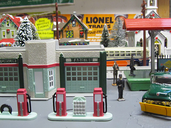
Here we have a nice full service gas station, with an attendant waiting to service your car.  Here you get a nice view of the gas station, the platform a bus in the street behind and the buildings behind that.  Once again in macro mode, this would not have been possible (and the "boca" would have been beyond believable). 


However, if this is supposed to be an old time scene, we need more than just gas stations.  We need an Esso station (is that Esso as in Standard Oil - oops).  Now that is a gas station.


I left this picture in here as I liked the angle and to show some issues.  This is a platform.  There are taxis waiting to pick up the travelers.  The tracks are around the other side of the platform.  Looks like Santa on the platform, but it is hard to see.  This picture was not really in good focus, but repaired to this level through sharpening.  That gives the halo look around the lines that are seen here.  Not a bad picture, but could have been better.


I wanted to make sure Santa got seen.  However, this shot also shows another problem (one that I did not have the time or setup myself to work around).  The shadows on the platform are a bit too dark (trust me the flash does not help, but makes it much worse).  Taking pictures of minatures really requires that lighting be taken into account.  I fixed this one a little by using the shadow highlight feature in photoshop (to lighten only the dark areas).  It is not bad, but a small light (or using softer ones above at mulitple anges) would have helped greatly.


I figured I would close this out with the church.  More evidence of the Christmas theme (Christmas mass is advertised on the sign).  The pastor is waiting on the steps to greet the traveler. 

Wednesday, September 29, 2010

Goodbye Jack.....We'll Keep Looking Up (and get better)!!!!!

I remember staying up late and watching Dr Who on PBS (yes, we sponsored them just for the Dr Who, and they cancelled it after that season).  After Dr Who, Jack Horkheimer would come on with his short spot on interesting events in space.  These were short blurps about what you could find interesting in space (with a small telescope or even the naked eye).  I always enjoyed his spots, and even looked for them often on the internet.  Unfortunately Jack passed away on August 20.

I figured the fact that Jupiter was as close as it would be for a long time, I would take advantage of the event to get some space pictures as sort of my memorial.  Well, good thing Jack was good natured, and always encouraging (after my attempt it would be necessary).  I commented that I would post the pictures good or bad, and go over my struggles.

First the struggles.  I ended up with only one shot at it.  Weather and travel worked against me, and I was unable to get out for a second night.  Well, I setup the telescope and snapped a few pictures of the moon to get started.  Obviously a full telescope is not really needed for the moon, but it was more of a checkout.  A picture is below.  Note, I was not really as interested in a moon shot as Jupiter was my real target.


Even with just a quick take, I was able to get some reasonable detail.  This was with the wider lens (as the longer lense was too long and the moon was too big to fit in).  Additionally the moon is really bright (so it was a quick exposure).  The combination of the wider lens and the bright moon made this possible.

Now we discuss Jupiter.  Sure it is alot bigger than the moon, but it is also a lot further away.  In order to get any visibility of it, I had to use the longer lens.  What this means is that the image moves across the field of view much quicker (the longer lens has a smaller field of few, and since the earth turns at a constant rate, items move quicker in the smaller space).  Making matters worse is the fact that Jupiter is not nearly as bright as the moon (much smaller and furter away, so less reflected light).  This means a longer exposure is needed.  Dark and movement are the bane of the photographer. 

Additionally, a camera is very different from an eye.  An eye can look sideways more into the lens to find objects.  The camera sort faces forward (it is mounted to do that).  It can not look around, so the object you want the picture of needs to be near the middle of the view (easy for the moon, not so much for a smaller object). 

Now some of you are saying, I need a better telescope.  There are telescopes that will track objects in space to help overcome this.  Well, my telescope is capable of this, but unfortunately the callibration process is manual.  You start by pointing it flat towards the north.  Then it will find an object that is bright, and ask you to center the object in the frame.  It does this a few times, then wholla, it knows where it is, and can find and track anything in the sky.  My problem is not so much the telescope, but my location.  Living in the woods is nice, but has its drawbacks.  I tried multiple times unsuccesfully to calibrate.  My problem is that the horizon is so high for me that all I could see were trees (except straight up, which did not help with the calibration).  I wanted to try going out to a field or something, but never got the chance. 

So with no further belly aching, I will go with my poor pictures.

Note, it did look a bit better through the telescope without the camera.  Not as much color as we see in the pictures from Nasa, but you could see the lines etc (just more gray and white than the pictures).  Did not come out well in pictures.  However, I am not giving up, I will give this another go in the future (just probably not Jupiter).

Wednesday, September 22, 2010

Fall Fair Season

I was hoping to do a post on some stellar pictures in memory of Jack Horkhiemer (who recently passed on).  However, so far my results are laughable at best, so I am going to take a few more shots (yes I will go over my problems as well, might as well see the problems).  So in order to not leave this blog un-updated for too long, I decided to show some pictures of one of the things we all like about fall and that is the fairs. 

These pictures were all taken at the GDS fair.  A fair is a great place for color and contrast.  Every ride has its color and the flags and decorations.  These make for some great pictures.  In order to really make the colors pop, you will see that I bumped up the saturation (and vibrance) on each of these pictures. 

Another thing to keep in mind while taking fair pictures is to look up.  For example, look at the picture below.

There are alot of rigging and rides that stick up into the sky (which if the weather is nice, gives a nice background itself).  This was taken from a corner of the fair, to try and get alot of the high rides.  The jumper is in the foreground with the ferris wheel, zipper and slide in the background (I could have gottne the round up and the pharohs ride, but would have lost the slide, and not gotten the jumper in the foreground (with the nice colored flags).  I liked this picture better.

In addition to the randomness of a bunch of rides, also try and isolate some (as in below).


Here is the Ferris wheel (always a nice choice).  This really stands out because we have a nice blue sky.  Clouds would break up the image, but as it stands we get the Ferris wheel by itself.  It would have been nicer to get a few more colors in the Ferris wheel (and maybe not as much blue).  However, you have to take what you get.

There are other things at the fair, not just rides.  I like the old machines.  They do not run them all at once, but they all get going.  They actually had an old mixer setup and making ice cream (which they were giving away).


Instead of the normal picture in the front of the tent, I decided to take one from the back.  It is a different perspective of the equipment.  I sorta liked the pile of equipment in the wagon.  All waiting its chance to get out front to be shown off and operated. 

Oh, there is another fair tradition.  Not always the most photogenic, but definitely a popular event.

What would a fair be without the metal bending of a smash up derby.  This was the first one the little guy watched (we normally do not attend, but enjoy the mostly empty fair while others cram in).  It was fun.  They did 4 rounds, they had a truck round.  3 of the trucks got hung up or stalled and came back at the end to bend some metal.

Well, after the derby it starts to get dark.  No need to put the camera away, fairs are normally well lit, and offer alot of good picture opportunities.  This one below was actually not night (but dusk).  I ran out to the car between heats at the derby (get some jackets it was getting cool).  The entrance offered a nice picture so I stopped and took one.

I like the lights and the color.  And some broken clouds add a nice background.  I probably should have tried to move around to the other side a bit, and taken a longer photo (with a few other rides on the side).  This would have reduced the sky a bit and added more color and light.  Next time.

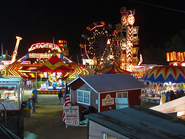
Well, as I said, try it at night as well.  Here is an example of a night picture.
 
The Fair Princesses Palace is right in the middle (looks like a barn - but hold the negative thoughts, lets keep it nice).  I took a few pictures, but liked this one the best.  Another interesting one had the zipper as a blur in motion, but I preferred the defined structure.  Still alot of colors, now offset by the black sky.  You can see that there is plenty of light (some of those rides are moving - you can see if you look closely).  The picture was taken at an ISO of 400 appeture at f/4 and the exposure time was 1/8 of a second (I did brace the camera against a rail to ensure it was steady).  Another trick for long exposures is to set the delay to 2 or 10 seconds.  This way you can steady from the act of pushing the button before the picture is taken.

Fairs are bright, colorful and offer alot of picture opportunities.  So next time you go to the fair, take your camera, and dont forget to just look for some interesting shots.

Friday, September 3, 2010

A Infrared Walk Through

Much like I did with the church, I thought it might be nice to go through an infrared project and my work flow with it.  Note, the fun thing about this is that you can really make your own changes, and come up with something nice, but at least this will be how I go about it (and experiment to see what I will get).  You can follow these steps and get reasonable results (or deviate and use your own settings as I will point out to get results that really appeal to you).  I am picking a subject that has not been on the blog before, and one that I think I would stop early on (and not take to completion as the next to last step actually looks the best). 

The picture was taken during the more recent trip (with the family) to Mohonk Mt House.  With the girls at the spa, I was able to take the little guy up the mountain to the tower.  Though I got some nice pictures from up there, the best infrared picture was actually of the tower itself. 

Before we begin, a note about setup.  I used the Canon SX210 for this picture (it is the only one I have setup to do Infrared).  I use a HOYA Infrared (R72) filter attached to an Adorama camera/filter adapter (allows us of standard filters that are 52mm thread type).  The adapter holds the camera and the filter in front of it, and can be mounted onto tripod (and I use the larger DSLR sized gorilla flexible tripod as it is easy to carry and stable with all this weight).  For processing I am using Photoshop CS4.  With that out of the way, lets get started.  Remember clicking on a picture will bring up a larger version of the picture.


Here is the picture as captured by the camera.  Notice the red shift.  Seems most of the cameras I have tested with the filter seem to shift to the red (though all a bit differently).  With the Hoya R72, there is a little normal light that gets through (but very little, looks black to me when I look through it).  This little light seems to mess with the white balance and shift the color to red.  Note, I say this because of some research I have done, it appears that changing the white balance can change the image (and other cameras do shift differently).  However, I have not experimented with it, because in the end, this image is not what I want to show (yeah even though I posted it here).

So here is the image converted to black and white.  For this I do not do anything too fancy (I just de-saturate).  I do bump up the contrast and the sharpening (as it helps with the look).  This image is much better than the above, and did not require any real effort.  So normally I save off a copy of the black and white version (to have it for comparison etc) then undo this step (go back to the first image above as I want access to that little bit of color information).

Now I play with the coloring a bit (for this example I used the auto settings in Photoshop CS4 - to show how that works, you can change the results quite a bit by using the sliders and coming up with your own settings).  Step one is auto color.  That cleans it up quite a bit. Step 2 is auto tone.  That leaves the image above.  I like this image, I think the sky is really nice.  If I were going for an image to publish, I would probably stop here.  Instead of using the auto functions above, I would use the sliders and pull out a bit of the darker red (not in the sky, but tinting in the building). I might even select just the building and perform the next step.


So some people really like the sky to shift back to the blue.  Doing this is easy.  Just go into Adjustments - Channel mixer.  Once in that pop up, select the red output channel.  Set red to 0, and blue to 100%.  Then select the blue output channel.  Set the blue to 0 and the red to 100% (basically flopping the blue and red collors).  Doing that yields the picture above.  Note, using someting other than 100% can change the hue a bit (and it is good to experiment, I was using the normal full swap for illustration). 

So it is possible for relatively little money to get some very artsy options in your picture taking (really changes people as well as landscapes, I will continue to play with this).  So go ahead, point the TV remote at your camera (hit any button) and see if it lights up in the screen (if it is good an bright, your camera lets alot of infrared through and you are almost there).  Then purchase a simple filter and a way to attach it and you are good to go.  Note, this can be done with better results on a DSLR, but it is not as simple, nor as cheap, so I am holding off on it (your DSLR will be permanently converted, and not do regular pictures anymore).