Tuesday, August 17, 2010

TIme for some animals

Looking at the blog, I feel I have left out the animals.  I tend to take quite a few animal pictures, so they seemed to be missing here (living in the woods provides alot of chances to get some animal pictures).  I figured I would post a few here.  No little squirrels or chimpmunks this time (but I am sure I will get some in the future).   I have a good archive of pictures of animals, and if I go any period without getting any new ones, I will go back to it (I have some baby foxes, bear, and of course the squirrel and chimpmunk pictures).  Thinking about it, I do not get alot of birds (maybe I should focus on that for awhile).

As before, just click the picture to get a bigger view.

Well hear some crashing on the porch and what do you get.  This little guy (actually he was one of two, but the other ran off first and stayed further away).  Here he is with his ill gotten goodies (or at least the little bag it was in).  Forget to take a little gabage down just once and leave it on the porch and look what happens.  Well, at least he let me get this picture of him.  The little Sx210 did pretty good considering it was dark (the big light is behind him, notice the light in the porch). 

Here is a Deer resting itself in the shade.  This is actually in our front yard under an evergreen tree (I put the rock pile there as they will eventually be a small wall around a garden).  Deer often sit in the yard under the trees during the heat of the day.  They are used to humans, so you can get close, but not too close (they will run away if you get too close).  However, with 14x zoom, I do not need to get too close.


So obviously if you wait, big deer with end up having little deer.  So here is an example.  We get a handful of these each year.  They are normally more skitish than the older ones, but sometimes when they are sitting, the just do not like to get up (so you can get close).  It is fun watching them run around. 


Well, I might not get birds, but I do get butterflies.  I liked thie picture mostly due to the colors.  The butterfly blended very well with the middle of the flower.  Nice picture, was hard to get the butterfly to stand still for me (but obviously I worked it out).


Here is another butterfly (also hard to get to stand still).  I thought both pictrures worked out well with the surrounding colors.  Unlike the last one where the butterfly matched the center of the flower so wekk, here we get a bit of a contrast.  Still looks nice.


Well, for my final picture I have picked a strange one.  We have been having frogs in the pool (and need to figure out a way to stop it).  Here is the first one (the water was not cleaned yet).  First, what is a water frog (or 8) doing this far from the water (the lake is way down the hill).  Last year I dug a 6 ft hole in the yard, and 6 frogs moved in when it filled with water.  We carried him out far into the woods many times, and he kept coming back.  Finally we located him down to the lake (so hopefully he has a better home).  This picture was taken early when we could get close (after capturing him a couple of times he started to jump and swim away as soon as we approached).

Those were some animals.  I am actually looking at some lunar pictrures as well as some more examples of infrared for my next posts.  I am learning alot taking pictures through the telescope, also getting better seeing the infrared before processing it on the computer.  Both will be fun, so stay tuned.

Tuesday, July 20, 2010

Some Fireworks for the Fourth (well not exactly)

I figured with the recent Holiday (the 4th of July), I figured I would post some fireworks.  However, I did not get these from any Independence celebration.  These came a little late as I attended a baseball game with our church on the 16th (so not really holiday material) and the game ended with fireworks.  I used the SX214 (see I knew that camera would be useful, I think all the pictures I have posted so far are from that camera).  It has a fireworks mode (that worked out well).  As our seats were quite high in the stadium, we had good views of the fireworks).  The anti shake really showed its stuff in these shots as I was quite impressed with the quality.  Below are some of my favorites (I took about 30).

Obviously I did not know what to expect when I pressed the shutter.  I pointed to where the fireworks were going, and then seen what came of it.  I did time (with reasonable success) when I saw the rockets going up, but did not know what type of firework I was going to get etc.  But you know, when in doubt keep clicking you are bound to get some good pictures (and that is what is nice about digital, easy to delete).  As a side note, I was sucessful enough in timing it that out of the 30+ picutres I only deleted 2.

Remember to get a larger image, click on the picture.

This one is nice as I was able to capture two going off next to each other.  Colors are a little bland (at least got some colors on the one on the right), however the alignment is really cool.  Notice a 3rd coming up from below.

A little more color here.  I really like this one as it shows the multiple stages of the firework.  We see 2 shooting up.  One just exploding and one fading away.  Nice timing, nice shot.


This is a nice single shot. The streams outward, with the changing colors. I liked how this came out so cleanly (nothing else in the frame, a little smoke glowing off to the right, but really a nice lone colorful firework on a black background.

The color and shapes really grabbed me on this one.  The blues with the gold.  The cross in the middle was a bit poetic (considering I was there with the church).  Another nice single shot with a clean background (but this one shifted to blue opposed to the redder one above).


I liked this one because it is very divergent.  On the right we have what looks like some sinister mace (with dark tips on the spikes).  Were the one next to it looks like a soft dandelion (a simple breath can send it flowing). 
I hope that you liked my fireworks show.

Tuesday, June 29, 2010

Infrared (well not exactly)

Well, I am finally going to publish some infrared pictures.  We spent a long weekend over at Mohonk Mt house awhile back, and there are some great picture possibilities there.  With Infrared, it is nice to get some water and the sky in a single picture.  Well there is a nice quiet lake that fits that bill really nicely.  As I did not put the money into upgrading the rebel (I did not want it single purpose), I am taking these pictures with the SX210.  The noise from the SX210 is a concern as these are long exposures (I can not see any light through the filter, so takes awhile).  I have just purchased noise ninja plug in for photo shop to work around this.  It was not used for these pictures, but shows some real promise (you will see some of that soon).

Note, most of these are not true infrared, as a true infrared picture would have no color.  Most of these are false color images (basically I needed to do some swapping to get the blue sky etc).  I thikn the false color images look nicer so that is what I am working with (not true infrared).  Let me show you what I mean.  Both images below are of the Mohonk Mt House from across the lake.  You will also see a little hut on the rock, there are many of these little huts scattered around the lake.

The image above is a true infrared image as it has no color (note that is not exactly accurate either as some color does get through the filter, but it is a truer infrared image than what follows).   Notice how the water in the forground is black and the foliage is white.  These are characteristics of a true infrared image.  Notice how the infrared really gives this image an old "antiqued" type of look.  It really works for this picture.

This is the same image, but I kept some color information.  Notice that the sky still has some blue to it.  In the original image, the sky is red.  In order to get the sky blue, I needed to swap the red and blue colors.  So now we have a picture that is peculiar to the eye.  The sky is blue, so that looks right, the water is still black  and the leaves white (well I picked a little pinkish for these, you will see that I can target different tones).  Though the above image does have its charm (and in this example, I find both almost equally as pleasing, which is why I used this image).  In general,  I think the false color image holds a bit more interest.


This picture is more full on for the house (it is still much longer in both directions, it would be difficult to get the enitre house and still have reasonable detail).  I was able to make the sky a bit lighter blue here.  The reflections in the lake steal from the blackness of it a bit.  Though there is a bit more color, and the house is shown off nicely, I prefer the first image.  Everything was just more striking.

I posted this one to show some of the problems.  I really struggled with the coloring on this one.  Though I liked the little yellow in the trees, getting the red out of the rocks was tough.  The only way to do this right would have been to start singling out areas and specific colors.  I did not want to go there, as it takes longer, and really takes away from the fun.  I do not mind moving colors around, but I do it for the entire image, so the image is still as it was (just moving some sliders would put it back).  If I did too much, almost not worth starting with the infrared (could start with any image).  However, with those rules, this image just did not work out.

This one is taken from above the hill down onto the boat docks (you can rent (free for guests) row boats, canoes or peddle boats).  This worked out as the water really held its black.  Though the reflections are obvious, it looks like ebony.  You can see that the evergreen type trees are darker than the ones with full leaves.  This is natrual as the leaves really reflect the infrared light, and whiten up much more.  Adds some nice contrast (especially with the dock).  The lines in this one go every direction (tree line up to the right, dock down to the left etc - adds to the peculiarity of the infrared image, but do not pull the eye to an interesting subject). 

Portraits are a specailty of infrared photography.  It adds a nice glow to the skin, removes all the imperfections and really adds some nice affects.  This is really not a good portrait, as it is not a close up, and really captures the person in the surroundings more.  I could not quite get the colors right in this one either.  However, I found a nice attractive young lady willing to let me snap her picture, so I took the picture.  You can see a hint of what I was talking about with the skin in this picture.

The good news for infrared photography is time of day.  Most photos taken with the sun overhead do not look good.  They look too harsh.  Really want to snap most photos at dawn or dusk when colors are in the air, and the lighting and shadows are not that harsh.  Infrared is the opposite.  You really want a bright sun (so you can get some infrared light to shoot).  So if you decide to try, buy that filter.  Leave it off in the morning, put it back on during the middle of the day, and take it back off as the evening approaches.  It will keep you taking some nice nature photos all day long.

Though I liked the results, I am not ready to upgrade a DSLR and take the full plunge.  I want to play with infrared some more with my less expensive setup (just the 210 point and shoot and the Hoya R72 infrared filter (and a mount I got from Adorama to hold the filter in front of the camera)).  It is hard to make sure you get a good picture, but sometimes you get surprised.  You can see from above, not counting the portrait, the first picture is really nice and the one with the dock not bad, other than that a bit of a struggle to get something nice.  There are a handful of other so so pictures that I did not publish.  I want to see if I can get the average up a bit better and I also want to play with some better portraits.  So some more to come.

Friday, June 11, 2010

Work Flow on a Church

I was going through creating some of the IR photos for a future post, and thought it would be a good idea to give you the type of work flow I am more used to.  Taking some sky pictures helped drive this home (you will see).  I do not do this for alot of pictures (just those I make special projects).  I started this one quite awhile back (and am only finishing it now) as I stopped in the middle for a project for the county fair, and scanning many old slides I got from my parents, and putting together a set of better pictures (scans need some cleaning) into a digital frame for there 50th anniversary.

Remember - click on any of the images to see a larger version.

So, the goal was to get a picture of the church.  Actually on this day, I took alot of pictures around the church, not alot of the whole church (this was a mistake).  After looking at the pictures, I though that grabbing an entire view would be best (but was limited).  Below is the initial picture.


This is really a bad picture.  Even with my wide angle lense (I used the Canon 10-22 for the Digital Rebel) it was hard to get the entire church.  Biggest problem was that as I was at ground level, it was hard to get the entire steeple in the picture (you can see that I tipped the camera up, which caused the lines to slant making the church look like it was leaning).  So problems with this picture included:

  • The Crop was bad (easily fixed)

  • Phone and power lines in the way (we love power and phone except the cables in pictures)

  • The building is distorted (so it looks to be leaning over)

  • The sky is bland (and this happens alot - its hard to expose for everything).
So even with all of this, I decided this picture was actually not that bad, and I could fix everything in Photoshop (and I did).  There was alot of good in this picture.  It was the right angle for this church.  We got the sign out front.  The entire steeple was included.  Coloring was not bad, but could use some punch.  Finally, taking a new picture would probably not yield any better results (in order to straighten the lines, I would need to get higher so I could point straight at the church and capture the steeple straight on, not pointing up).

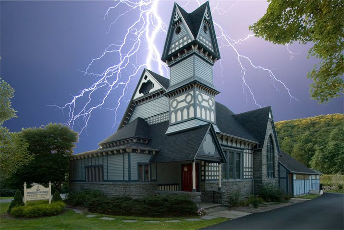
However, the point, as I was saying above, I was taking some sky pictures, and they come especially useful in cases like this.  I do not normally show my sky pictures, but I use them.  Even with the first 3 bullets above fixed, the best this would ever be is a bland picture (with no real sky).  So the sky needs to be added.  Note, some of the pictures were mine, others were skies I found on the internet.  Note, I am leaning towards the more regular skies (but included a few for fun - note I had some real crazy ones but left them out as they are not even in the running).  Once a sky is picked for the final picture, I will adjust the rest of the picture so the coloring looks more natural.

Different skies do change the tone of the picture greatly, but also look at the fixed crop, the straightened building and the removal of junk (power lines).  These pictures are all far better than the one above.  The foreground is still in a neutral state, once I decide on a direction, I will make changes to that which will better match the sky.

So lets look at some of the outputs:
 

This one is sorta my favorite.  I like the streaks of sun and the colors over the church.  Also it is really easy as the coloring is about right already (no need to change the tone of the image).  The sky is light enough not to take away from the church (which is the subjet).  Maybe the cloud in the bottom left should be moved as it looks weird down so low, but clouds could be anywhere, and it adds to the streaks hitting it).


The sky is nice here, but maybe a bit to blue.  The clouds are really realistic and it all looks much more normal.  However, the coloring in the sky seems to take the view from the church (not enhance the church).  If I keep this one, I will probably go to the cloud layer in photoshop and reduce the saturation a bit (and not touch the forground).


This one is nice, but the light directions do not quite line up.  Also, the blue being darker here seems to pull away from color in the building.  The sky seems to just cover the church (which is no good).  If I decide to keep this one, I will probably lighten the sky to reduce this effect.


This was more of a fun one.  Maybe we did something wrong or something (who knows).  However, it is a neat effect, and one that would not require any changing to the forground.  Sort of the opposite of my favorite on top (with the colored sun streaks).


Here is a nice sunset.  Fortunately, the sun is setting to the left (so the hills on the right still look ok).  You can see how the very different shade of sky makes the church and foreground seem wrong.  If I chose this sky, I woul have to apply a filter to this in order to make it look more like it was lit from a red sky.


Similar to above, but not so deep (a bit more purple).  Nice sunset with the sun on the left side of the picture (matching the foreground).  However, I just think the sky is too different for this one. 

All the abover are examples of how a picture can be improved.  First thing I worked was perspective.  I straightened up the building then got the crop I wanted.  After the perspective was close, I cleaned up the unwanted stuff (phone lines).  In this case, I also erased out the sky (even between the leaves).  Finally I fixed up the lighting, coloring and then sharpened.  Then I had a nice forground that I could use with any sky.

So if you see a nice sky, even if it has no context, get a picture of it (exposing for the sky to capture it nicely).  You might find some other picture in your life crying out for an improved sky (and you can use it there).


Monday, June 7, 2010

So here are the Spring Flowers

As a bit of instruction, clicking on any of the images in this blog will bring up a bigger image (still not full size I shrunk them before loading, so do not worry about download speeds).  If there is a particular picture that you would like to see full size, let me know (and I can either post it, or send it to you).  Just open a comment at the end of the post.

Since its spring I figure its time to pretty things up a bit.  With that, the best chance I have is to use some pictures from the recent trip to Mohonk.  It was late spring and the flowers were really in bloom.  As we were really there to relax and enjoy the outdoors, I did not carry the Rebel, but only the SX210.  That worked out ok in this case.  Though I will admit that I am a little disappointed in the noise in this camera, it can be overcome at low ISO (this is why it is important to put some time into testing to understand the strengths and weaknesses of the equipment).  You would think that a little camera like this would not be good for macro (normally the small cameras do not blur the background, and get the subject to pop as do the DSLR counterparts).  However, in this aspect, for a small pocket camera the SX210 shines.  Note on all pictures below, only resizing of the image was necessary, I did not sharpen or otherwise alter (I did not feel it was needed).


The picture above was taken under harsh lighting conditions (mid day, and no clouds blocking the sun).  This forced the contrast up, but in this case, you can still see what I was looking for.  The nice pink circular pink flower (and some friends) above the much darker green (and the shadows were very dark).  If you click on the picture, you will see very good details and the camera really captured the image well.  This picture is still good enough, with enough data, that if you wanted to soften it and reduce the contrast in Photoshop, that would be possible (but I liked it punchy like it is).


This example did not work out as well as the one above (and that is why I include it).  Here you can see the problem with pictures with the sun bright and high.  The colors did not come out well at all, and everything is a bit harsh.  Detail is still good (you can click on it to see for yourself), but really not a pretty picture (which is what flower pictures are supposed to be about).  A good example of what to watch out for (and why to avoid harsh lighting).  Changing the angle of the shot or a little shade would have helped greatly).


Above is the best example (in  my opinion) of a single flower picture I took.  No harsh lighting, the flower is visible in high detail (click it to see it better).  The colors are really nice.  Also, the subject stands out nicely, while the background is blurred out.  Normally this is a difficult shot with a pocket camera (I could not have done this on the SD1100).  However, with 14X zoom, all I had to do was zoom all the way, and stand only a few feet back.  This really shortened the focus length, allowing only the subject to maintain sharp focus.


This is really a cheat (they look like flowers, but really are on more of a bush/tree).  I put this here to further demonstrate the above shrinking of the focus length (depth of field).  Here you can see that the flowers in the middle (at the prime focus point) are really sharp.  However, the sharpness fall off quickly (for a pocket camera) and the ones behind it are not nearly as in focus. 


Back to the real flowers, and here was a nice pair that I had to shoot together.  Again, the background is not that out of focus (but I was not trying as hard, as the leaves are part of the picture, and though the camera can have the depth of field shortened, it still is not as good as a DSLR).  


Well the gardens are all great, and I figured I would get a picture that included one of the workers.  I used the full zoom so I could stand back and not scare him off (this decreased the depth of field as above, which worked for this shot).  The detail in the flowers and even the wings of the bee were remarkable (click it to zoom in to see if you like).  This was definitely a busy bee (there were lots of flowers, and he was hitting all of them).  Though these are smaller flowers (and not nearly as decorative as those above), I really liked the colors.  The blue pedals with the yellow centers (with reddish spots). 

This was a fun trip for pictures (and I still have at least one more update from it - this time infra red).  The camera functioned quite well.  Though it did not perform as well as a DSLR with a good macro lense, I got many flower pictures that I was more than happy with.  I hope you enjoyed my attempt to pretty up this space with a few spring flowers.  Until next time keep snapping pictures.


Friday, May 28, 2010

Pictures to Calm the Soul

Spring (and Fall) are normally higher stress times for me. It is the time to prepare for the coming season (Summer or Winter - funny Spring and Fall really do not require any preparations). There is always alot going on in the Spring and Fall (kids sports, needed work around the house etc). So it is a good time to sit back and make sure that some time is spent enjoying a hobby. In order to advance this theme, I am including some pictures of just that, calming and relaxing scenes. I do not know why, but for me (and many others) water tends to have a calming effect, so I will begin there.

This first picture was taken along a stream during one of my youngest's baseball practices.  Though I watch the games, I tend to wander around the field for the practice (its either that, or sit there and wonder why he is dancing in the outfield etc, taking some relaxing pictures is definitely better for the soul).  You can see, the foliage is not full yet at the time this was taken (a few weeks back), but is really coming in now.


You can see that this is a nice wandering stream.  We are at a quite bend in the river, and can look quite a ways down stream.  The picture below is a slightly zoomed in to show the ripples in the water as it works over the rocks in the bend. 


This final one from this stream is a close up of an interesting rock.  The SX210 does a nice job of being able to zoom in and pick out details.


This picture just shows some of the rocks sitting in the stream, getting continually carressed by the current in the stream.
In addition to Baseball Games and Practices, the little guy also gets me out to other things.  The pictures below were taken along a stream at the Woodlands.  The little guy was there for some testing, and I figured I would take some pictures while he was hard at work.


This stream was nice, you could hear the water rushing over the rocks.  It was still peaceful (probably due to the size, not thundering).  The Stream Meanders around the back of the woodlands (were there are a few places to sit and watch the stream - as I said water has that calming affect). 


This picture is just a close up, a little bit more up the stream.  Both of these pictures were taken from the same small walking bridge going over the stream (a nice place to hang out).  I took a few pictures from the bridge (using the stream as a nice background) as well (but those are for the web page).

Finally, a calm sky also gives the feeling of relaxation.  So to not make it feel left out (and have our focus only on the water), I will include some sky pictures.  Both were taken at Baseball games between ininnings.  I did modify these pictures slightly (a little Photo Shop Shadows-Highlights to put some color into the foreground).


In this picture, the sun had just gone down.  The sky was becoming more blue, but the sun was getting under the clouds (see how they are lit up on the lower edge away from us).  I thought the contrast in colors was nice (the sky goes from light to blue, with bits of grey and pink clouds fluffed in).  I did not overdue the lightening on the shadows, here, but just enough so the trees were not fully black (digital cameras have lower contrast capability and can not always distinguish between light skies and dark trees, so if exposed for the sky (as I did) the trees will be dark).


This final image was taken from the rain game (same one I got the picture of the rainbow through the cemetary I posted previously.  I think the lightening of the trees is a little more obviousl in this picture, but felt I needed to do it.  You can see the street light in the foreground was not yet on (and they were still playing baseball), so I wanted to have some light in the foreground.  However, the sky was really bright.  Was a nice sky to look up into while waiting on the game.

All of these pictures were taken with the SX210.  It pays to have a camera in the pocket.  Though I really like the quality out of the Digital Rebel more, I do not like it that much more to carry it around everywhere.  I will get some pictures up here with that eventually.

Enough for this post.  We have recently taken a  visit to Mohonk Mountain.  I will post some pictures from there next (I even took a few IR photos, so we can see how those come out). 

Tuesday, May 11, 2010

Thats Why You Should Always Carry a Camera

I have been taking alot of pictures lately.  Most of the little guy playing baseball, but some more general ones I will post here as well.  I will post them over the coming week or so.  The SX210 is working out very well for me.  Small enough to carry, and a nice boost in quality and the zoom is very nice. 

After taking the picture below, I thought it was important to update the blog.  I think this is a very interesting picture.  Even beyond interesting, it shows that upgrading the everyday carry camera (vs the special DSLR) definitely has it advantages.  We were at a little league game, and it started to pour.  Though the clouds were severe, they were also patchy.  The storm only lasted about 15 minutes.  Interestingly two rainbows followed it (but moved quickly). 


I had to snap quickly (for my second picture, the rainbow was already out of the graveyard into the woods).  The long zoom of the SX210 was very helpful, as without it, I would have either had to crop greatly to get this picture, or run out into the field (and as the rainbow was moving faster than I can, that would not have worked out well).

You can see from the tree in the foreground (and the shadows) that it became light very quickly.  You can also see the second rainbow in the top right of the picture.  These were full rainbows, but the other side was not nearly as interesting.  Catching the rainbow coming down into the cemetary was an interesting combination of pictures you do not see together often.  Here we have the brightness from the sun and the colorfulness of the rainbow offset by the somber emotion evoked from the cemetary and the menacing dark sky in the background.  Without a little camera in my pocket, I would never have gotten this one. 

There is always alot going around us, and if we want to be able to capture it, we have to be ready.

Thursday, April 29, 2010

A look at the SX210 Quality

Well we compared the SX210 to some more lofty type competition and found it is not really a replacement for a DSLR.  We also looked at the usability of the SX210 and found that it can be carried and used fairly easily.  There were a few issues pointed out, but none that really affected me (but it is up to the individual).  Now we might as well look at the quality.  Below is my test picture.

 
This is a good image.  Light quality in the corner is challenging.  Also there are alot of textures and colors.  You can see that overall quality is good.  Overall there is no complaints with this image. Alot of colors, and they all came out good.  The texture in the luggage showed up well as well as that on the couch.  Sharpness was good as well (wording on the books and the fish food).  However, this is small for the file size, and if printed you would get to see much more pixel depth.

So lets look at this a bit closer.  All the pictures below are at 100% magnification (so you see the individual pixels).  I will start with the picture as taken (with flash) so the lighting was at its best.  There will be three pictures.  The first will be from the SD1100 (as a comparison - remember I have always been happy with the quality of this camera) the middle one will be the SX210 at a reduced resolution (9MP mode) and the bottom one will be the full resolution (14MP).  I will get to why I chose to do this.


You can see that the SD1100 does a good job.  It is well saturated and the colors are good.  You can see a little noise in the cushion on the couch, but it is not bad.  This will be our baseline. 


The SX210 at 9MP above looks good as well.  The saturation is not as full as the SD1100.  However, if you like the deeper saturation, that can be set in the options on the SX210 (in the "manual" modes).  Noise is not bad, it is about the same as the SD1100.


The SX210 at 14MP above looks similar in color and saturation to the 9MP picture.  However, more noise is noticed in both the cushion and the blue book.  This is why I wanted to show three different pictures.  One being the SD1100 (8MP), one being the SX210 at 9MP and one the SX210 at the full 14MP. 

What is not determined by this test is the cause of the noise.  Does Canon average pixels, does higher resolutions just show the noise more (more detail means more noise).  And the real question is why do I seem so concerned about noise.  Well, I have found that a large percentage of my pictures are taken in low light situations (kids concerts, plays, ceremonies etc).  As such, noise has always been sort of a focus for me (and I have multiple ways to reduce it) (and I am not that concerned, but I like to understand the limitations of my hardware as with this knowledge, I can get the better pictures).  


Above we have the SX210 at 9MP on the left and 14MP on the right (I left the SD1100 out in the dark test it was slightly less noisy and less sharp than the 9MP image).  Note, if your screen is not wide enough, the 9MP might show above the 14MP.  Both of these were shot in reduced light, no flash (ISO 400).  At higher ISOs the noise starts to really stand out.  In fact one might argue that the noise in the higher resolution picture reduces the effective resolution (the 9MP image looks a bit sharper). 

My complaint here is that 14MP looks really good on a spec sheet.  However, a printed enlargement from a 14MP is not that much larger than a 10MP, but the more pixels on the small sensor make noise a bigger issue.  This might make one of the competing cameras (with slightly less resolution) a little more attractive to some.  If this is a concern of yours, take a memory card into the store, and shoot some pictures and compare the cameras.

Well enough looking at noise.  With a good processing work flow, noise can be cleaned up (with little quality degradation).  The next picture shows the real reason that I picked up the SX210, and the reason that I really like it (and I keep it in my pocket).


Yes, there is a little actually quite a bit more noise in this picture than I would have with the Digital Rebel, but you really need to look at the pixels to seem them.   This is a picture I could never have gotten withoutt Rebel and a long zoom lense (so the SD1100 was not even an option).  Being able to pull a small camera out of my pocket and get a picture of the little guy on second base is what this camera is really about.  Granted, I will still carry the Rebel at times, but now as long as I have the SX210, I can get the picture (and it is still a good quality picture). 

Conclusion -

So what is the point.  If you look closely for noise you will find it (in any image).  However, Canon really tried to stretch the numbers on this camera.  It has the highest zoom with the highest pixel count of any camera in its class.  This camera takes good pictures (look at the entire image on top - and at the pictures I will be posting to this blog in the future).  However, if you are looking at getting one of the extended zooms, I do not know if I would put alot of emphasis on a few MP.  Even a 10MP image can be blown up larger than most people print (and might have less noise). 

At some point, stuffing more pixels on the same size sensor will start to degrade performance (point of diminishing returns).  Looking at the pictures I have above (and others, but I did not want to make this too long), I believe that Canon has crossed into this region of diminishing returns.  Not sure a 10 or 12 MP camera would not return just as nice pictures.

To Canon's credit, they seem not to try and reduce the noise very much (I have seen examples from the site I mentioned in an earlier post of other cameras that apply too much noise reduction, and remove data from the picture).  This is good, as it maitains more data (so we can pull the data out in post processing).   

As far as quality goes, the camera is still a Canon.  As such (as with most of there camera) you get very good pictures.  Though this is listed as an advanced camera, the quality is on par with there PowerShot line.  Though this is not a bad thing, you will have to decide if the camera is worth the extra money.  For less money, you can get similar quality (without the zoom).

For me, getting the long zoom was what I really needed.  On the Rebel, I use the long zoom (at 300mm) most of the time.  Helps me capture the kids on field or stage (even rides at the fair etc).  Having something I can pocket that does this makes it very useful.  You will have to decide if it is worth it to you, or is a less expensive camera (with less zoom) that takes as good of pictures good enough.

As an Appendix, two extra features of the camera (one I love, one I hate).

Continuous mode pictures.  I use this alot to capture our little leagure (or whatever sport).  However though the SX210 has this mode, they might as well have left it off.  It takes more than a second between pictures (so not a couple pictures a second, but a second and a half a picture).  This means the action is moving.  Making matters worse is the fact that the screen goes blank in this mode (so you sort of have to hope your still pointed at it).  Not a mode I will be using (so when I want this, I will have to bring the Rebel).

Movie mode.  I am very happy with this mode.  I normally do not use my camera for movies.  I never really liked the quality (thats what a camcorder is for).  However, the quality of these movies is really good.  Having the zoom work during recording is great (previous Canon camera did not do this).  Some complain they can hear the zoom motor in the recording, I have not really noticed this.  I will say that if in the wind, putting a rag or something on the microphones will help (picks up alot of wind noise without it).  The quailty is great.  I have recorded the little guy batting, so we can check his swing together.


Saturday, April 24, 2010

Canon SX219 IS review - general usage

This is the second section of my review, and it deals with general usage.  I will go over things like portability, feature use etc.  The third update will be a more detailed look at performance.  I do not plan on doing a complete performance comparison (my look is more as I use the camera) as those reviews can be found elsewhere (like http://www.cameralabs.com/reviews/Canon_PowerShot_SX210_IS/index.shtml is a good review - note they did see the same noise issue I brought up in the comparison). 

So as this is my daily camera to catch those unexpected pictures, and allow one to always have the ability to capture the picture.  My previous camera that fit this requirement was the Canon SD1100IS and it made me very happy (the only reason to upgrade was for a longer zoom so I could get some shots that I was not getting with the SD1100IS).   Since the SD1100 made me very happy (except for the zoom), there will be alot of comparisons to that camera here.  In order for this camera to be usable everyday, it has to be something that is easy to carry so that I would carry it every day.

The SD1100 did fit this bill very nicely, and I normally carried it in my left pocket (sometimes in one of my cargo pocets, but I always had it with me).  So lets look at the two side by side:


You can see the SX210 is a bit longer than the SD1100 (it is actually slightly higher and deeper as well, but those differences are much more subtle).  It is also a bit heavier.  Probably the biggest difference is the lense dial sticking out a bit (to get caught on stuff).  However, I could still easily slip this into my shirt pocket (between shots), or carry in my palm (like I often do at a park or other fun spot).  So from that perspective, the SX210 gives up some heft to get the 14X zoom, but still usable.

The next problem is that I do not just put the camera in my pocket.  I like to put it into a case to protect it (scratches or bumps if something hits my pocket).  In addition to just the camera, I always carry a spare battery and memory card (sometimes people accuse me of excessive complusive tendencies)).  I also like a case that fits well enough that the zipper does not rub the camera (don't want to scratch it up).  The first case I tried was too big (it was a Swiss Army case).  Though everything fit well, it would be difficult to carry that load everyday.  Then in Staples, I found a small Case Logic case.  This fit just right.  So lets compare the SX210 inside the case with the SD1100 inside the best case I had found for that.


Now, the differences are not as large.  The SD1100 case I was using is still a little shorter, but also a bit deeper (because the larger outer compartment to hold the battery/memory card).  The nice thing about the Case Logic case is that the outer pocket is flush (and so the camera still slides in and out of the pocket very well). 

I have added one other picture of the camera (who wants to see the camera, we want to see pictures from the camera) inside the case to give you an idea how it all fits.


You can see the memory card and battery are in the front compartment.  When zipped up the zipper actually slides under the flap, so the front is competely flat.  I put the camera in upside down (so the lense is towards us in the picture).  This keeps the lense away from the battery, and keeps the entire case flat.  Note I did add a piece of plastic to the back of the front pocked (to protect the camera).  If you look closely at the camera  pictures you will see a little ding on the front of the lense (this happened before I added the plastic, it seems very secure now). 

So, one problem is solved.  I can carry the SX210 almost as easily as the SD1100.  So I will have it with me when I want to take pictures.  So how about usabiliy once I decide I want to take a picture (not discussing quality, that will be in the final update, just how usable it is). 

From a speed perspective, the SX210 is a little slower than the SD1100.  When turned on, it is ready to take a picture within 3 seconds (closer to 2, but just over).  The SD1100 takes about half a second less.  For most pictures this is not a huge deal (half a second does not mean much to me, normally I have it on already getting ready for the picture).  Both the SX210 and the SD1100 have similar delay after pushing the shutter to snap the picture.  The SD1100 shows the picture taken preview a little quicker than the SX210. 

That is it for the speed advantage for the SD1100.  In setting up the picture, the SX210 far outshines the SD1100 (more than making up for the slight slower responses noted above).  Having a dial on the back to change mode means I can quickly change to a portrait or a landscape shot (night shot etc).  Also the auto mode on the SX210 really works (it does a nice job picking out the scene type it should be using and getting a good photo).  The auto on the SD1100 is more like the easy mode on the SX210 (no settings, it does it all).  I do not particularly like this mode on either camera (and do not seem to get consistent good results with this mode). 

So the SD1100 takes more time to configure than the SX210 (if needed, but more likely if you set it to auto, you will not need to configure anything).  The SX210 also has full manual modes (something I like as I am used to using the Digital Rebel).  So if you want to use a slow shutter (to blur moving water etc), you just set it that way.  The SD1100 (like many compact cameras) does not have this capability (as compacts are supposed to be point and shoots, and this capability is deemed not necessary). 

There are two quirks on the SX210 that you will have to get around (as far as usability).  First is the LCD screen is wide screen, but pictures are not (except for in movie mode).  So the screen is fully used in movie mode, but only the middle of the screen is used when taking pictures (there are some indicators in the black bars on the sides).  This seems to bother some people, but honestly I did not even notice it (until I read it in another review).

The second quirk is the flash pops up everytime you turn on the camera.  You can push it down, but it pops up at startup even if not needed.  Actually the weird location of the flash causes me to have my finger on it (not tight) when I turn it on.  I feel it push a little, then it closes (my finger pushes it down).  Then if I want the flash, I have to manually pull it up.  Its a bit weird, and this bothered me at first, but now I barely notice it now.  Both of these issues might turn you off (and affect actually usability), so its something to consider.

The final usability issue is the strap that came with the camera.  I do not like it (it is too big, and there is no slide to get it tight around the wrist).  If I am carrying the camera in my palm (as brought up above), I feel that if I drop it, the strap will just slide off and offer no protection.  My work around was to take the strap off of the SD1100 (nice smaller strap, and it had a little pry tool (to open the side) which could be slid up to make it tight on the wrist (excessive compulsive again? not sure).

Next update will be some pictures and a discussion on quality.