Tuesday, June 29, 2010

Infrared (well not exactly)

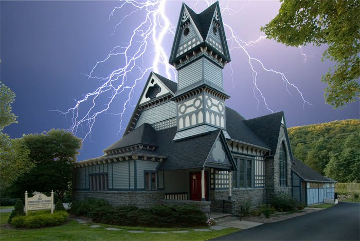
Well, I am finally going to publish some infrared pictures.  We spent a long weekend over at Mohonk Mt house awhile back, and there are some great picture possibilities there.  With Infrared, it is nice to get some water and the sky in a single picture.  Well there is a nice quiet lake that fits that bill really nicely.  As I did not put the money into upgrading the rebel (I did not want it single purpose), I am taking these pictures with the SX210.  The noise from the SX210 is a concern as these are long exposures (I can not see any light through the filter, so takes awhile).  I have just purchased noise ninja plug in for photo shop to work around this.  It was not used for these pictures, but shows some real promise (you will see some of that soon).

Note, most of these are not true infrared, as a true infrared picture would have no color.  Most of these are false color images (basically I needed to do some swapping to get the blue sky etc).  I thikn the false color images look nicer so that is what I am working with (not true infrared).  Let me show you what I mean.  Both images below are of the Mohonk Mt House from across the lake.  You will also see a little hut on the rock, there are many of these little huts scattered around the lake.

The image above is a true infrared image as it has no color (note that is not exactly accurate either as some color does get through the filter, but it is a truer infrared image than what follows).   Notice how the water in the forground is black and the foliage is white.  These are characteristics of a true infrared image.  Notice how the infrared really gives this image an old "antiqued" type of look.  It really works for this picture.

This is the same image, but I kept some color information.  Notice that the sky still has some blue to it.  In the original image, the sky is red.  In order to get the sky blue, I needed to swap the red and blue colors.  So now we have a picture that is peculiar to the eye.  The sky is blue, so that looks right, the water is still black  and the leaves white (well I picked a little pinkish for these, you will see that I can target different tones).  Though the above image does have its charm (and in this example, I find both almost equally as pleasing, which is why I used this image).  In general,  I think the false color image holds a bit more interest.


This picture is more full on for the house (it is still much longer in both directions, it would be difficult to get the enitre house and still have reasonable detail).  I was able to make the sky a bit lighter blue here.  The reflections in the lake steal from the blackness of it a bit.  Though there is a bit more color, and the house is shown off nicely, I prefer the first image.  Everything was just more striking.

I posted this one to show some of the problems.  I really struggled with the coloring on this one.  Though I liked the little yellow in the trees, getting the red out of the rocks was tough.  The only way to do this right would have been to start singling out areas and specific colors.  I did not want to go there, as it takes longer, and really takes away from the fun.  I do not mind moving colors around, but I do it for the entire image, so the image is still as it was (just moving some sliders would put it back).  If I did too much, almost not worth starting with the infrared (could start with any image).  However, with those rules, this image just did not work out.

This one is taken from above the hill down onto the boat docks (you can rent (free for guests) row boats, canoes or peddle boats).  This worked out as the water really held its black.  Though the reflections are obvious, it looks like ebony.  You can see that the evergreen type trees are darker than the ones with full leaves.  This is natrual as the leaves really reflect the infrared light, and whiten up much more.  Adds some nice contrast (especially with the dock).  The lines in this one go every direction (tree line up to the right, dock down to the left etc - adds to the peculiarity of the infrared image, but do not pull the eye to an interesting subject). 

Portraits are a specailty of infrared photography.  It adds a nice glow to the skin, removes all the imperfections and really adds some nice affects.  This is really not a good portrait, as it is not a close up, and really captures the person in the surroundings more.  I could not quite get the colors right in this one either.  However, I found a nice attractive young lady willing to let me snap her picture, so I took the picture.  You can see a hint of what I was talking about with the skin in this picture.

The good news for infrared photography is time of day.  Most photos taken with the sun overhead do not look good.  They look too harsh.  Really want to snap most photos at dawn or dusk when colors are in the air, and the lighting and shadows are not that harsh.  Infrared is the opposite.  You really want a bright sun (so you can get some infrared light to shoot).  So if you decide to try, buy that filter.  Leave it off in the morning, put it back on during the middle of the day, and take it back off as the evening approaches.  It will keep you taking some nice nature photos all day long.

Though I liked the results, I am not ready to upgrade a DSLR and take the full plunge.  I want to play with infrared some more with my less expensive setup (just the 210 point and shoot and the Hoya R72 infrared filter (and a mount I got from Adorama to hold the filter in front of the camera)).  It is hard to make sure you get a good picture, but sometimes you get surprised.  You can see from above, not counting the portrait, the first picture is really nice and the one with the dock not bad, other than that a bit of a struggle to get something nice.  There are a handful of other so so pictures that I did not publish.  I want to see if I can get the average up a bit better and I also want to play with some better portraits.  So some more to come.

Friday, June 11, 2010

Work Flow on a Church

I was going through creating some of the IR photos for a future post, and thought it would be a good idea to give you the type of work flow I am more used to.  Taking some sky pictures helped drive this home (you will see).  I do not do this for alot of pictures (just those I make special projects).  I started this one quite awhile back (and am only finishing it now) as I stopped in the middle for a project for the county fair, and scanning many old slides I got from my parents, and putting together a set of better pictures (scans need some cleaning) into a digital frame for there 50th anniversary.

Remember - click on any of the images to see a larger version.

So, the goal was to get a picture of the church.  Actually on this day, I took alot of pictures around the church, not alot of the whole church (this was a mistake).  After looking at the pictures, I though that grabbing an entire view would be best (but was limited).  Below is the initial picture.


This is really a bad picture.  Even with my wide angle lense (I used the Canon 10-22 for the Digital Rebel) it was hard to get the entire church.  Biggest problem was that as I was at ground level, it was hard to get the entire steeple in the picture (you can see that I tipped the camera up, which caused the lines to slant making the church look like it was leaning).  So problems with this picture included:

  • The Crop was bad (easily fixed)

  • Phone and power lines in the way (we love power and phone except the cables in pictures)

  • The building is distorted (so it looks to be leaning over)

  • The sky is bland (and this happens alot - its hard to expose for everything).
So even with all of this, I decided this picture was actually not that bad, and I could fix everything in Photoshop (and I did).  There was alot of good in this picture.  It was the right angle for this church.  We got the sign out front.  The entire steeple was included.  Coloring was not bad, but could use some punch.  Finally, taking a new picture would probably not yield any better results (in order to straighten the lines, I would need to get higher so I could point straight at the church and capture the steeple straight on, not pointing up).

However, the point, as I was saying above, I was taking some sky pictures, and they come especially useful in cases like this.  I do not normally show my sky pictures, but I use them.  Even with the first 3 bullets above fixed, the best this would ever be is a bland picture (with no real sky).  So the sky needs to be added.  Note, some of the pictures were mine, others were skies I found on the internet.  Note, I am leaning towards the more regular skies (but included a few for fun - note I had some real crazy ones but left them out as they are not even in the running).  Once a sky is picked for the final picture, I will adjust the rest of the picture so the coloring looks more natural.

Different skies do change the tone of the picture greatly, but also look at the fixed crop, the straightened building and the removal of junk (power lines).  These pictures are all far better than the one above.  The foreground is still in a neutral state, once I decide on a direction, I will make changes to that which will better match the sky.

So lets look at some of the outputs:
 

This one is sorta my favorite.  I like the streaks of sun and the colors over the church.  Also it is really easy as the coloring is about right already (no need to change the tone of the image).  The sky is light enough not to take away from the church (which is the subjet).  Maybe the cloud in the bottom left should be moved as it looks weird down so low, but clouds could be anywhere, and it adds to the streaks hitting it).


The sky is nice here, but maybe a bit to blue.  The clouds are really realistic and it all looks much more normal.  However, the coloring in the sky seems to take the view from the church (not enhance the church).  If I keep this one, I will probably go to the cloud layer in photoshop and reduce the saturation a bit (and not touch the forground).


This one is nice, but the light directions do not quite line up.  Also, the blue being darker here seems to pull away from color in the building.  The sky seems to just cover the church (which is no good).  If I decide to keep this one, I will probably lighten the sky to reduce this effect.


This was more of a fun one.  Maybe we did something wrong or something (who knows).  However, it is a neat effect, and one that would not require any changing to the forground.  Sort of the opposite of my favorite on top (with the colored sun streaks).


Here is a nice sunset.  Fortunately, the sun is setting to the left (so the hills on the right still look ok).  You can see how the very different shade of sky makes the church and foreground seem wrong.  If I chose this sky, I woul have to apply a filter to this in order to make it look more like it was lit from a red sky.


Similar to above, but not so deep (a bit more purple).  Nice sunset with the sun on the left side of the picture (matching the foreground).  However, I just think the sky is too different for this one. 

All the abover are examples of how a picture can be improved.  First thing I worked was perspective.  I straightened up the building then got the crop I wanted.  After the perspective was close, I cleaned up the unwanted stuff (phone lines).  In this case, I also erased out the sky (even between the leaves).  Finally I fixed up the lighting, coloring and then sharpened.  Then I had a nice forground that I could use with any sky.

So if you see a nice sky, even if it has no context, get a picture of it (exposing for the sky to capture it nicely).  You might find some other picture in your life crying out for an improved sky (and you can use it there).


Monday, June 7, 2010

So here are the Spring Flowers

As a bit of instruction, clicking on any of the images in this blog will bring up a bigger image (still not full size I shrunk them before loading, so do not worry about download speeds).  If there is a particular picture that you would like to see full size, let me know (and I can either post it, or send it to you).  Just open a comment at the end of the post.

Since its spring I figure its time to pretty things up a bit.  With that, the best chance I have is to use some pictures from the recent trip to Mohonk.  It was late spring and the flowers were really in bloom.  As we were really there to relax and enjoy the outdoors, I did not carry the Rebel, but only the SX210.  That worked out ok in this case.  Though I will admit that I am a little disappointed in the noise in this camera, it can be overcome at low ISO (this is why it is important to put some time into testing to understand the strengths and weaknesses of the equipment).  You would think that a little camera like this would not be good for macro (normally the small cameras do not blur the background, and get the subject to pop as do the DSLR counterparts).  However, in this aspect, for a small pocket camera the SX210 shines.  Note on all pictures below, only resizing of the image was necessary, I did not sharpen or otherwise alter (I did not feel it was needed).


The picture above was taken under harsh lighting conditions (mid day, and no clouds blocking the sun).  This forced the contrast up, but in this case, you can still see what I was looking for.  The nice pink circular pink flower (and some friends) above the much darker green (and the shadows were very dark).  If you click on the picture, you will see very good details and the camera really captured the image well.  This picture is still good enough, with enough data, that if you wanted to soften it and reduce the contrast in Photoshop, that would be possible (but I liked it punchy like it is).


This example did not work out as well as the one above (and that is why I include it).  Here you can see the problem with pictures with the sun bright and high.  The colors did not come out well at all, and everything is a bit harsh.  Detail is still good (you can click on it to see for yourself), but really not a pretty picture (which is what flower pictures are supposed to be about).  A good example of what to watch out for (and why to avoid harsh lighting).  Changing the angle of the shot or a little shade would have helped greatly).


Above is the best example (in  my opinion) of a single flower picture I took.  No harsh lighting, the flower is visible in high detail (click it to see it better).  The colors are really nice.  Also, the subject stands out nicely, while the background is blurred out.  Normally this is a difficult shot with a pocket camera (I could not have done this on the SD1100).  However, with 14X zoom, all I had to do was zoom all the way, and stand only a few feet back.  This really shortened the focus length, allowing only the subject to maintain sharp focus.


This is really a cheat (they look like flowers, but really are on more of a bush/tree).  I put this here to further demonstrate the above shrinking of the focus length (depth of field).  Here you can see that the flowers in the middle (at the prime focus point) are really sharp.  However, the sharpness fall off quickly (for a pocket camera) and the ones behind it are not nearly as in focus. 


Back to the real flowers, and here was a nice pair that I had to shoot together.  Again, the background is not that out of focus (but I was not trying as hard, as the leaves are part of the picture, and though the camera can have the depth of field shortened, it still is not as good as a DSLR).  


Well the gardens are all great, and I figured I would get a picture that included one of the workers.  I used the full zoom so I could stand back and not scare him off (this decreased the depth of field as above, which worked for this shot).  The detail in the flowers and even the wings of the bee were remarkable (click it to zoom in to see if you like).  This was definitely a busy bee (there were lots of flowers, and he was hitting all of them).  Though these are smaller flowers (and not nearly as decorative as those above), I really liked the colors.  The blue pedals with the yellow centers (with reddish spots). 

This was a fun trip for pictures (and I still have at least one more update from it - this time infra red).  The camera functioned quite well.  Though it did not perform as well as a DSLR with a good macro lense, I got many flower pictures that I was more than happy with.  I hope you enjoyed my attempt to pretty up this space with a few spring flowers.  Until next time keep snapping pictures.