Remember - click on any of the images to see a larger version.
So, the goal was to get a picture of the church. Actually on this day, I took alot of pictures around the church, not alot of the whole church (this was a mistake). After looking at the pictures, I though that grabbing an entire view would be best (but was limited). Below is the initial picture.

This is really a bad picture. Even with my wide angle lense (I used the Canon 10-22 for the Digital Rebel) it was hard to get the entire church. Biggest problem was that as I was at ground level, it was hard to get the entire steeple in the picture (you can see that I tipped the camera up, which caused the lines to slant making the church look like it was leaning). So problems with this picture included:
The Crop was bad (easily fixed)
Phone and power lines in the way (we love power and phone except the cables in pictures)
The building is distorted (so it looks to be leaning over)
The sky is bland (and this happens alot - its hard to expose for everything).
So even with all of this, I decided this picture was actually not that bad, and I could fix everything in Photoshop (and I did). There was alot of good in this picture. It was the right angle for this church. We got the sign out front. The entire steeple was included. Coloring was not bad, but could use some punch. Finally, taking a new picture would probably not yield any better results (in order to straighten the lines, I would need to get higher so I could point straight at the church and capture the steeple straight on, not pointing up).
However, the point, as I was saying above, I was taking some sky pictures, and they come especially useful in cases like this. I do not normally show my sky pictures, but I use them. Even with the first 3 bullets above fixed, the best this would ever be is a bland picture (with no real sky). So the sky needs to be added. Note, some of the pictures were mine, others were skies I found on the internet. Note, I am leaning towards the more regular skies (but included a few for fun - note I had some real crazy ones but left them out as they are not even in the running). Once a sky is picked for the final picture, I will adjust the rest of the picture so the coloring looks more natural.
Different skies do change the tone of the picture greatly, but also look at the fixed crop, the straightened building and the removal of junk (power lines). These pictures are all far better than the one above. The foreground is still in a neutral state, once I decide on a direction, I will make changes to that which will better match the sky.
So lets look at some of the outputs:

This one is sorta my favorite. I like the streaks of sun and the colors over the church. Also it is really easy as the coloring is about right already (no need to change the tone of the image). The sky is light enough not to take away from the church (which is the subjet). Maybe the cloud in the bottom left should be moved as it looks weird down so low, but clouds could be anywhere, and it adds to the streaks hitting it).

The sky is nice here, but maybe a bit to blue. The clouds are really realistic and it all looks much more normal. However, the coloring in the sky seems to take the view from the church (not enhance the church). If I keep this one, I will probably go to the cloud layer in photoshop and reduce the saturation a bit (and not touch the forground).

This one is nice, but the light directions do not quite line up. Also, the blue being darker here seems to pull away from color in the building. The sky seems to just cover the church (which is no good). If I decide to keep this one, I will probably lighten the sky to reduce this effect.
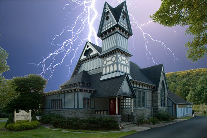
This was more of a fun one. Maybe we did something wrong or something (who knows). However, it is a neat effect, and one that would not require any changing to the forground. Sort of the opposite of my favorite on top (with the colored sun streaks).

Here is a nice sunset. Fortunately, the sun is setting to the left (so the hills on the right still look ok). You can see how the very different shade of sky makes the church and foreground seem wrong. If I chose this sky, I woul have to apply a filter to this in order to make it look more like it was lit from a red sky.

Similar to above, but not so deep (a bit more purple). Nice sunset with the sun on the left side of the picture (matching the foreground). However, I just think the sky is too different for this one.
All the abover are examples of how a picture can be improved. First thing I worked was perspective. I straightened up the building then got the crop I wanted. After the perspective was close, I cleaned up the unwanted stuff (phone lines). In this case, I also erased out the sky (even between the leaves). Finally I fixed up the lighting, coloring and then sharpened. Then I had a nice forground that I could use with any sky.
So if you see a nice sky, even if it has no context, get a picture of it (exposing for the sky to capture it nicely). You might find some other picture in your life crying out for an improved sky (and you can use it there).
Love this post. Has Pastor viewed your post?
ReplyDeleteI believe he has. I also gave him 4X6 copies of this. I can make a larger print of any of these.
ReplyDelete